

Key Takeaways
What a Price History Chart Actually Shows You
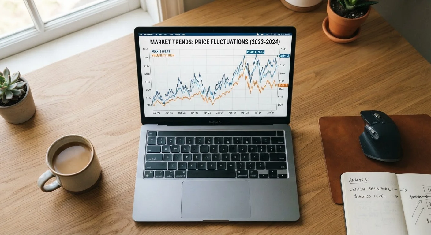
A price history chart is a simple line graph: time runs along the horizontal axis, price runs along the vertical axis, and every recorded data point connects to form a line. What it reveals is the pricing behavior of a specific product listing over days, weeks, or months - not a snapshot, but a pattern.
Before you interpret any chart, understand what it does not show. It tracks the price of one listing from one retailer or marketplace. It does not account for price differences across channels - a detail covered in depth in why online prices aren't always lower than in-store. If the product is sold in multiple places at different prices, the chart you're reading may be incomplete without additional comparison.
The chart also doesn't tell you whether a price is fair in absolute terms - only whether it is low, high, or average relative to its own history. That distinction matters enormously. For a fuller foundation, see how price history tools work before proceeding.
Longer Time Windows Reveal More
When a price tracking tool lets you choose your date range, default to at least six months of data. Short windows can make a price look unusually low when it is simply returning to normal after a temporary spike. More data points produce a more reliable picture of the item's true pricing behavior.
The Five Elements to Identify on Any Chart
Once you pull up a price history chart, look for these five features before drawing any conclusions:
- The historical floor. The lowest price the item has ever reached in the tracked period. This is your anchor. If today's price is at or near the floor, the evidence is stronger that the current price represents genuine value.
- The historical ceiling. The highest recorded price. Items that frequently touch the ceiling before a sale event are often being artificially inflated - a tactic sometimes called "anchor pricing." If the chart shows the price jumping sharply right before a major sale, then dropping back to what it normally sells for, the "discount" is likely manufactured.
- The average price line. Many price tracking tools overlay an average. A current price sitting near the average - even if the badge says "20% off" - means you are paying a typical amount, not a low one. Understanding what separates a sale price from a good price helps put this in context.
- Seasonal patterns. Look for recurring dips at the same time each year. Electronics, appliances, and home goods often follow predictable seasonal rhythms. A chart with 12 or more months of data will make these patterns visible.
- Volatility. A jagged, frequently changing line signals dynamic pricing - the price is adjusted often, sometimes daily. A flat line with occasional drops signals a more stable product. Each pattern calls for a different timing strategy.
Charts Only Reflect One Listing
A price history chart tracks a single product listing from a single source. Identical or equivalent items sold through other retailers, warehouse clubs, or in-store channels will have their own separate pricing histories. Treating one chart as the complete picture can cause you to miss a consistently lower price elsewhere. Always verify whether the same item is available through other channels before concluding the chart represents the market.
How to Read the Chart Before Deciding
With the five elements identified, apply this decision framework:
Note the current price and the tracked time window
Before reading anything into the shape of the chart, confirm how much data you are looking at. A 30-day window may not capture seasonal lows. A 365-day window gives you a full annual cycle. Adjust the time range if the tool allows it - longer windows are almost always more informative for infrequently purchased items.
Locate the historical floor and compare it to today's price
Find the lowest point on the chart. Calculate the percentage difference between that floor and the current price. If today's price is within roughly 5-10% of the historical low, the data supports that you are near a genuine low. If today's price is significantly above the floor, the chart is telling you to wait or look elsewhere.
Check whether the price rose sharply just before a sale
Scroll or zoom to any period just before a major promotional event visible in the chart. If the line spikes upward then drops to what it called a "sale price," compare that sale price to the pre-spike baseline. If the sale price is at or above the typical pre-spike price, the discount is largely cosmetic.
Identify the average price and evaluate your position relative to it
Use the average price line (or calculate a rough midpoint between floor and ceiling) to understand where today's price sits. Paying at or below average is neutral to good. Paying above average requires a separate justification - urgency, stock availability, or a specific need - not just a promotional badge.
Decide: buy now, wait, or set a price alert
With the full chart context in hand, choose one of three actions. If the current price is near the historical floor and meets your budget, the data supports purchasing now. If the price is at or above average with no seasonal low in sight, consider waiting. If the pattern shows recurring dips, use the price alert feature in your tracking tool to notify you when the price reaches your target - rather than checking manually every few days.
Combining chart analysis with cross-channel price comparison habits gives you the most complete picture. And if you want to build this into a broader money-saving routine, the Saving Money hub offers practical strategies that extend well beyond a single purchase decision.
The core skill here is patience with data. A chart read quickly can mislead just as easily as no chart at all - slowing down to identify each element systematically is what turns a tool into a genuine advantage. For more on how tracking data shapes purchasing decisions over time, see how price tracking changes what you're willing to pay.
Return to the Buyer's Basics hub for related guides on avoiding common purchasing traps.